
The easiest way to get and keep attention on your business is through social media. Facebook may be the “oldest” of the bunch, but it’s still relevant to marketing and promoting your business.
If you currently have a Facebook page set up for your business, perfect. If you don’t have one set up yet, do it now. Even if you’re the type that doesn’t want to be weighed down with the idea of managing different social media accounts. I still advise you to, at the minimum, create a Facebook page for your business.
A Facebook page can serve as a mini-website for your business and many times customers search for business information there before searching the internet. Alternatively, social media data typically appears first in Google’s search results. Which is why it’s important to have a page setup with relevant and fresh content.
Now when it comes to adding some curb-appeal to your Facebook page there are few key things that are important: style, layout, and responsiveness. Back in the old days, almost everyone viewed Facebook on a computer. But now the majority of users are mobile. However, the problem we keep seeing over and over again is companies using graphics that ONLY look good on larger devices. Why is this? We may never know, but rest assured we’re going to help you from being like those “other guys” and show you how to add curb appeal to your Facebook page.
The answer is it’s all bout the visuals.
Facebook Profile
The most important element on your page is your profile. How visitors recognize you and your content depends on how well you frame your brand. Your logo is everything here, and yes your logo is what should be used as your profile picture.
Consider how your profile picture is used throughout Facebook and at what size it’s often seen. The largest it will ever be viewed is when users are looking at your page. But for users who have already liked your page, their only seeing your content in their feed as they scroll past your post at 90 miles an hour – where your logo has been shrunken into a small circular image. Because, lets face it, we are trying to consume the maximum amount of content we can all at once.
Your one chance to capture users attention relies on how distinguishable your profile picture is in a sea of media. This is why we highly advise that you NOT use a picture of your building or product. Instead, choose your logo or brand icon over a white background or reversed-out (white) over a colored background.
Let’s look at some examples, good and bad.
 |
 |
From the two examples shown here, we can see what is working and what is not working for each. AirBNB has chosen to use their logo over their brand colors as a profile picture, making it easy for users to recognize. The layout of the icon is nicely cropped and still decipherable in small format. On the other hand, NOMA has chosen a picture of the museum. While it’s a work of art in itself, the building may only be recognizable to frequent visitors. Not a good choice for tourists or those unfamiliar with the location. Due to the “clutter” of the image, in small format the building could be mistaken for almost anything.
I know you may be thinking, well I can use a picture of my location because it says my page name next to the picture. This is true, you’ll never see a profile picture without a page name beside it. But, how often do we scroll slow enough to read each word on the screen? The answer is we don’t. We want to digest as much information as we can, which is why we scroll and scroll until a certain post looks interesting enough to make us stop, then the hunt continues.
Facebook Cover
Your Facebook page cover (photo or video) is where the real magic happens. This space is where you can create unique ads, branded imagery, or reels about your product. Use the cover area to your advantage by changing it out regularly. Maybe not every week, but at least once a month or every other month. Compared to your profile picture, selecting a Facebook cover is limitless.
There are various approaches you can take and with the addition of cover videos – which Facebook rolled out in 2017 – you have the ability to say more with the same amount of real estate. If you’re a local shop, use the space to advertise new products, specials/deals, or seasonal items. If you’re an organization, use the space to advertise upcoming functions/events, your mission statement, or examples of work. If you’re a business, use the space to showcase your people, services, or culture.
If you want to take a more laid-back approach then create a stylized graphic using your brand colors or imagery. The one over-overarching key to making your cover successful is to make sure the image/video is in keeping with your brand. Let’s look a few examples…
 |
 |
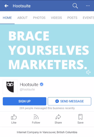
Finally, the most important thing to remember when creating a Facebook cover is responsiveness. Check that your photo or video looks good on computers, phones, and tablets. You can’t tell your message if your image/video is cropped on smaller devices. Take Hootsuite for example. They created a really great cover video about what their product can do, the only problem is their content in the video is cropped on mobile devices. This makes the video awkward to watch and takes away from the professionalism of their brand.

![]()
• • •
Hopefully, the examples above will inspire you or guide you on how to add curb-appeal to your Facebook page. Keep in mind the importance of ensuring your images/videos are uploaded at the correct resolution and that the layout of the image/video can be easily cropped for smaller formats. Do this and your business is sure to get a few more likes!
| [prev] | [next] |